Styles
Roman
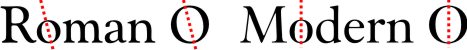
These are fonts derived from Roman type that was carved in stone. What makes Roman distinctive from the next category, Modern, is that the axis of the thick and thin of the letter O is usually at an angle.
Transitional
Fonts that stylistically fall between the old Roman style and the Modern style are sometimes called transiltional. I don't find adding this category useful for my purposes.
![]()
![]()
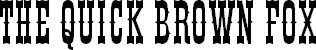
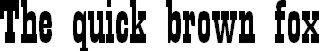
Modern
These are modernized Roman fonts. The thick and thin of the O is usually on a vertical axis. Modern fonts tend to have stronger verticals and stronger contrast.
Note that the serifs come in different varieties. As far as I'm concerned, the slant of the O determines whether the font is Roman or Modern and not the type of the serif.
![]()
![]()
![]()
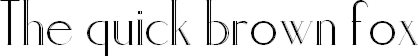
Sans Serif
This is a category for all fonts without serifs. Usually the thickness of the stroke is the same throughout each letter.
Serif Cheats: Often you an detect cheap fonts which are derived from sans-serif fonts. The cheap versions are serif fonts stretched horizontally or vertically,destroying the beauty and balance of the characters. One can also detect bad design where text is stretched to fit a space. In my opinion, designers should avoid stretching text at all costs, and the occasions where they do get away with it should be pretty rare. Unless you know what you're doing, you should not alter fonts.
There are some sans-serif fonts that do have thick and thin strokes. These fonts designed as such from the ground up, so they look far better and far more balanced than stretched fonts.
![]()
![]()
![]()
Sub-category
These are Modern and Sans Serif fonts that I'll never use as body text, so I created a sub-category for them.
Modern Decorative (Title or Display Fonts)
![]()
Sans Serif Decorative (Title or Display Fonts)
![]()
![]()
Almost Serif (or not quite sans-serif)
This group consists of fonts that have characteristics of Roman or Modern fonts, particularly the thick and thin strokes, but dont have prominent serifs.
![]()
![]()
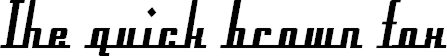
Slab-Serif
Many slab-serif fonts slow down reading when used in large blocks of text. For smaller blocks of text, they work fine. Some are designed strictly as decorative or title text.
In the first example below, the font has thick and thin strokes similar to Modern fonts, while the second example shows a slab-serif on a sans-serif font.
![]()
![]()
![]()
Stencil and Degraded Fonts (or Grungy fonts)
![]()
![]()
![]()
![]()
Western Fonts
These fonts are based on late 19th century U.S.A. wood type fonts. Wood type was blocky and had no fine lines.
Wood type fonts found their way into metal type and then digital type, and are far more refined than the early true wood type. We associate these fonts with the “Wild West” or the “Western Frontier.” Some users like to place fonts such as Driftwood (letters created out of twigs or slats of wood) in this category.
![]()
Typewriter Fonts
For those of us who have used typewriters, we know very well that most typewriters could only be monospaced. The typewriter font is available in monospace, as in the first example below. Similar fonts are available that are not monospaced, as in the second example.
There have been electric typewriters that had various space widths. I recall using an IBM where most letters were two spaces, the "m" and "w" were three spaces, and the "i" and "j" were a single space. I haven't yet seen a font designed too look like that IBM electric typewriter, but I'll surely like to add such a font to my collection.
More than ever, I've been meeting young people who have never used a typewriter, let alone owned or seen one. They don't know about 8-track or vinyl either. I suppose this style will continue to survive with variations just as the Western type continues.
![]()
![]()
Fat Faces
Fat Faces originally came about in the late 19th century. Famous fat face fonts are Elephant and Bodoni Utra, which can be easily classified as Modern.
Bodoni Ultra: ![]()
I place in this category all sorts of fonts that look really heavy and don't quite fit in any other category. From a historical perspetive, the two examples below are not “Fat Faces,” but from a practical point of view the category fits them perfectly.
![]()
![]()
Retro Fonts
This covers fonts from the late 19th century, such as Art Nouveau, to the 1970s.
![]()
![]()
Digital Fonts
These are fonts based on digital devices, such as the LED and dot fonts, or the requirements of digital devices, such OCR fonts.
![]()
![]()
![]()
Initial Caps
These were never meant to be used for whole words. They should be used as an Initial Cap (or Drop Cap or Versal Letter)
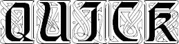
Uncials
See Wiki > Uncials
What make Uncials distinctive is the all-majuscule (uppercase) text, or what appears to be a mix of majuscule and miniscule (lowercase). In other words, there are no clear ascenders and descenders. Uncials are a cursive form of the Roman alphabet, which was initially all majuscule. Minuscule as we know it today developed from this cursive writing.
Modern Uncial fonts often include majuscule letters that are distinct from the miniscule letters.
![]()
![]()
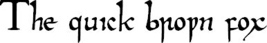
Gothic Script (or Blackletter)
See Wiki > Blackletter
I find the default kerning and word spacing, as seen below, a bit too much compared to original Gothic script. On the other hand, this wider kerning and word spacing makes this style easier to read.

![]()
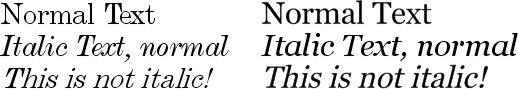
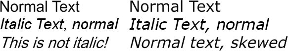
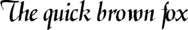
Calligraphic Fonts
These are based on writing produced with a flat pen nib. Italic versions of Roman and Modern fonts are not in this category.
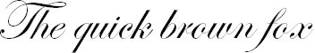
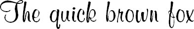
Script Fonts
These are based on writing produced with a pointed nib pen. Originally these pens were made out of quill, but nowadays calligraphers use steel nibs which are readily available, come in many sizes, are durable, and are easier to maintain.
The second example below is a cross between brush and pen. I chose to put it it under script because of the very carefully drawn quality.
See Wiki > Quill Pen
![]()
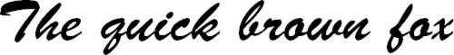
Brush Fonts
These fonts are based on wrting produced with a brush. Often we associate ink brushes with the Chinese writing implements, (See Wiki > Ink Brush) but a good sable brush and China ink can produce these fonts.
Some fonts in this category are based on writing produced with a broad brush, and are similar to signs you might see in the windows of a grocery store or liquor store. It's a style that continues to be used today for quickly made inexpensive advertising signs.
![]()
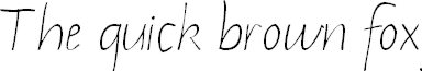
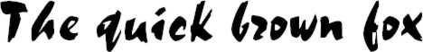
Handwriting
These fonts are based on plain handwritten text. The third example here shows chalkboard or crayon writing.
![]()
![]()
![]()
Graffiti Fonts
These fonts are based on urban graffiti, usually created with aerosol cans or very wide brushes. You'll find this graffiti in back alleys, warehouse and factory walls, especially the back walls of such buildings, and along rail lines. There are also many beautiful examples on railway shipping containers, under ramps and bridges, and many more places.
![]()
![]()
Technical Handwriting
These fonts are based on what you might see in technical drawings. They're based on text that is made with a round steel nib, a Rapidograph (Rotring), lettering templates, or text that is generated from early CAD software.
![]()
![]()